SLOW FOOD Re-fresh visual identity & website.
SLOW FOOD Re-fresh visual identity & website.

About.
Slow Food is a worldwide food movement that is committed to promoting a good, clean and fair food systeem.
Good.
Food that is qualitative, full of taste, nutritious and healthy.
Clean.
Produced with respect for nature.
Fair.
For sale for an honest price for both producer and consumer.
Slow Food stands for pure, tasty and varied food - the opposite of fast food, made
to be consumed hasty and mindless.
To underline Slow Food’s connection with the Slow Food Youth Network (SFYN) some of the SFYN graphic elements, colours and proportions have been integrated in the somewhat less sleek, authentic Slow Food style.
Typography.
Graphic elements.
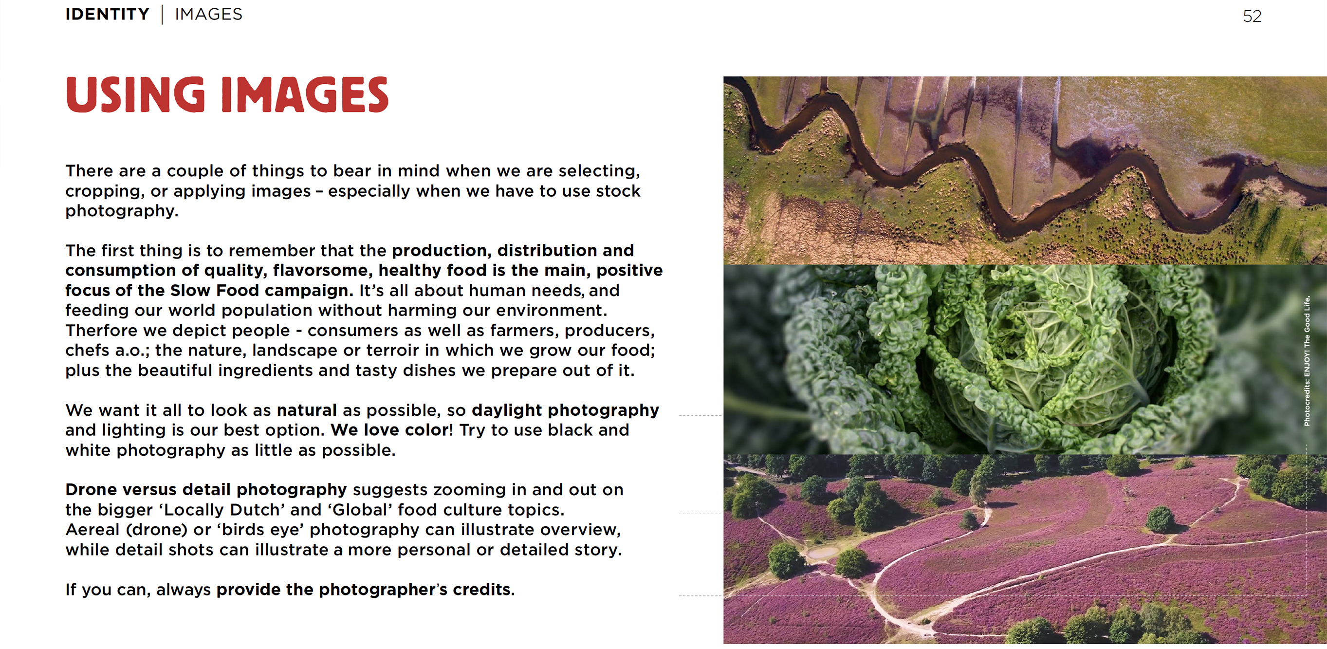
Colour palette. Photography.
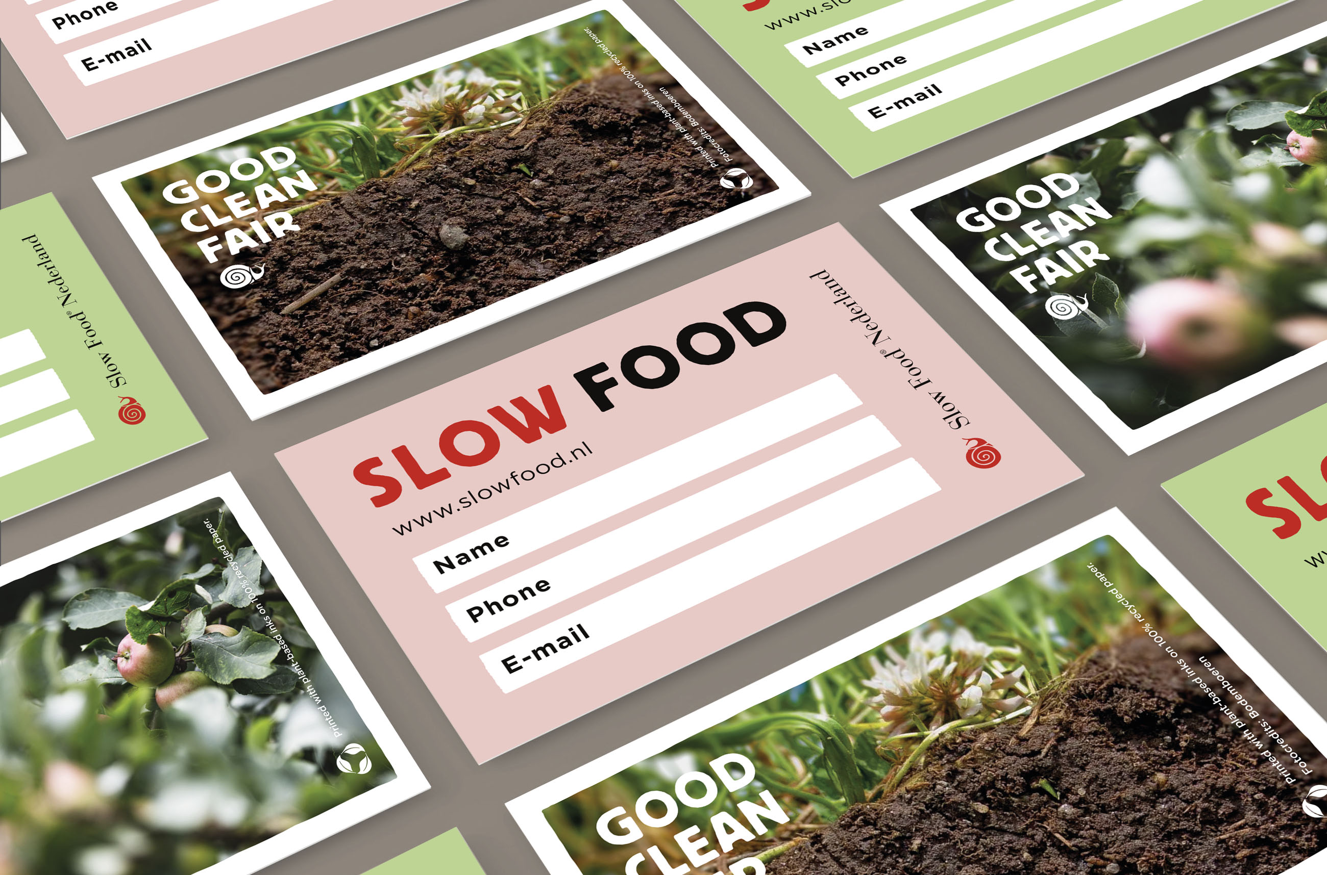
The recognisable, powerful black and red Slow Food colours stay - softened by a contemporary, fresh pastel colour palette. Serrated edges and font underline the non-standardised, authentic Slow Food message.
Drone vs detail photography suggest zooming in & out on the bigger Local Dutch and Global food culture topics.


Everyone is entitled to good food, sustainably produced at a fair price.
That’s why we bring together people from the entire food chain:
farmers, gardeners, chefs, fishermen, scientists, entrepeneurs and consumers.
Together we tackle important food issues.
That’s why we bring together people from the entire food chain:
farmers, gardeners, chefs, fishermen, scientists, entrepeneurs and consumers.
Together we tackle important food issues.
Creative direction.
Identity re-fresh.
Graphic design.
Brand book.
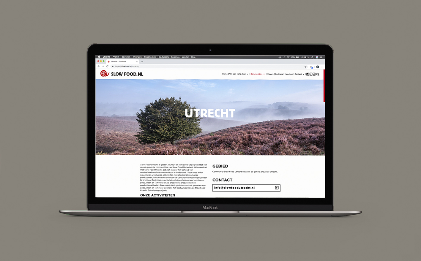
Website.
Slow Food
Identity re-fresh.
Graphic design.
Brand book.
Website.
________
Slow Food